So, what are the kids into these days? What on earth is going on?! Here were my basic unguided observations…
An assemblage of assemblages. Collages, mixed media, combinations of 2-D and 3-D elements…I was pleased to see the variety of techniques being combined and explored. A lot of the assemblages and sculptures felt almost like archeological studies rather than works of art. (But then again, where do you draw the line between the two?) Sculptures made out of found objects, or bits of paper presented together so that their implied backstories reveal some sort of insight. Or something. Well, I do find that sort of thing interesting to a point, but then again I did always like archeology.
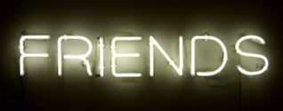
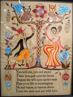
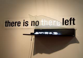
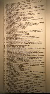
Lots of WORDS! Text was everywhere! A word incorporated into a painting, long script filling an entire canvas, a single phrase written in neon across a wall…the growing number of artists who want to same something without pictures amuses me.
What’s going on with photography?! Sculpture and mixed media works were abundant at the show…but there wasn’t a ton of photography. But what there was felt extremely stiff, staged, and calculated. Almost as though they were trying to fill the void once occupied by painting. Lots of posed scenes versus the spontaneity which always made photography so exciting for me.
The kids are all about line. I’m in love with line myself. But most of the artworks relying on line left me disappointed! I found that they fell into extremes: either using overly juvenile clumsy lines or overly calculated sterile geometric lines. (I’m talking about both in drawing and painting here.) Many times the line drawings were done on top of a collage background, like book pages. It didn’t really work. So I’m sad to report I didn’t see as many artists speaking with graceful beautiful lines as I would have liked. Call me traditional in that sense.
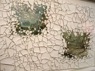
The paintings themselves literally had a lot of depth…but were visually flat. Let me explain…Artists creating more non-objective works were really exploring the sculptural possibilities of painting. There were lots of canvases that were altered, constructed, cut up, and manipulated to act more as a relief. And there were a lot of textures being created with playful application of paint. So I found it interesting that the artists leaning more towards realism were embracing a style that was much more visually flat...which isn’t a bad thing. There was a focus on patterns, prints, shapes and lines rather than volume and shadow. I personally enjoyed the combinations of various patterns, which implied textiles and constructed settings in a synthetic cubism sort of way.
There was this weird sexuality prevalent. However, it was more of an exhibitionist/ voyeuristic version of sexuality. Combining the innocent with the pornographic seemed to be the favored formula. Like a woman painted with garishly colorful (clown like) skin tones passively masturbating. Or childishly constructed dolls performing oral sex. For me, to see these works in a sterile gallery full of the prim-and-proper art crowd made these artworks of garish sexuality feel even more forced and artificial.
Reflection noitcelfeR. There was an abundance of artworks that actually included mirrors, which literally incorporates the viewer into the piece. And a lot of the work was about reflecting back at the viewers a digested/abstracted version of their own world. There were also a lot of melted forms in the sculpture realm. Are these pieces about the distortion of reality? Or simply the artist asking the viewer to fill in the blanks? Inquiring minds want to know. Or lose interest guessing and move on to the next booth, as in my case.
It contrasted the industrial versus the handmade. I was surprised by the amount of artworks that celebrated the craftsy-kitchy aesthetic. Many pieces incorporated sewing, glitter, and other craft staples. But in a gritty glitzy way. Heck, there were even a few dioramas! When it was done well, I really enjoyed the homespun twist on contemporary subject matter and I saw its irony. (But please, no more pile-of-rubbish sculptures please!!) On the other end of the spectrum, just as many pieces celebrated a more artificial aesthetic. (In the realm of sculpture especially.) Everywhere you looked there were metallics, foils, high-polish, and this whole shiny plastic thing going on. Neon lights were also popular.
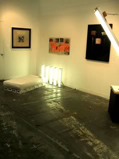
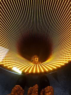
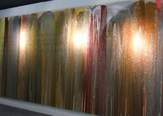
Now on to the pictures! Let's start with some lights shall we...
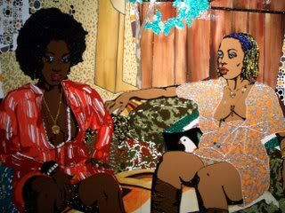
Yes, there's an embroidered penis on the left. And that's a tongue on the right doing exactly what you think they're doing!
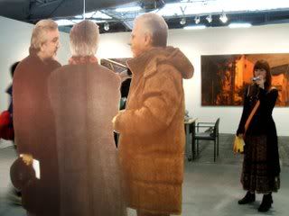
Hey, I'm in the art!
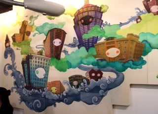
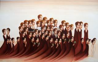
This big mural (on multiple canvas crossing three walls) was by Chiho Hoshima...

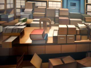
See what I'm saying with the photography?
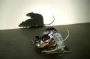
There was a shadow sculture (the sculpture itself is made of trash actually) by Tim Noble and Sue Webster but I forgot to take a picture of it! So here's the biggest version I found online, it's pretty funny...
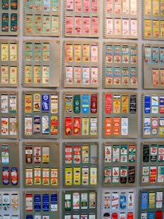
These are matchbooks presented here--the whole archaeological aesthetic...
I love the manipulation of the traditional "canvas" like these here (that's Elsie Wayne on the left)...
Not too many illustrator types, but here's one I saw I really liked...Sandra Scolnik.
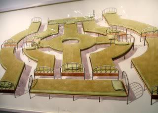
I loved the imaginative pieces by Los Carpinteros (they're a group of artists), their style reminded me of Wayne Thiebaud.
Why paint it when you can simply write it?
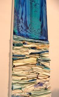
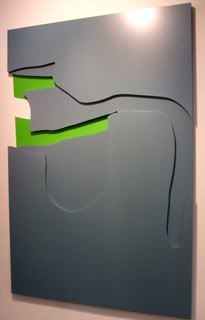
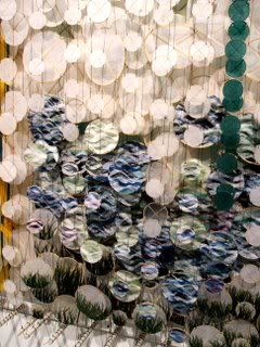
I love these two abstracted landscapes, they were more like relief sculptures. (Wonjulim and Jacob Hashimoto)
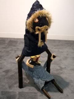
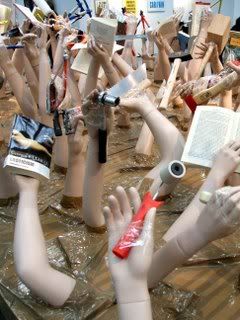
Raise your hand if you like sculptures made of random stuff put together!
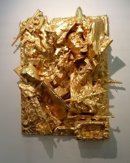
But add some glitz and it's classier...
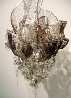
Glitter! Kitchy glam!
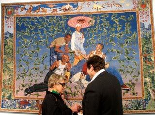
This pictures amuses me...who's in the art versus who's buying the art...
A rare realism sighting! I loved this one...Carl Hammond.
This is a John Waters piece...who knew!

No comments:
Post a Comment