Everything felt a bit crammed in, chaotic, too much of too much. I think that's why I leaned towards the simpler pieces that favored a more traditional aesthetic. I hate to say it, but all this newer crazy stuff simply doesn't have enough depth to sustain my interest. It lasts staying power. Like chewing gum.
The show was dominated by sculptures, installations, and videos so much that paintings felt like they were being treated like the "we're sorry, they're from out of town" cousins. Don't get me wrong, I mean, I did exclaim how I thought one pile of rocks was "really pretty!" And I appreciate the three-dimensional artwork's efforts to invite interaction. But for me the overabundance of representation/ replication/ recreation came across as simply overwhelming and recycled.
There were lots of collections of things, as though assembling them together makes them become more like archaeological objects. As my friend John put it, it seemed that many of the artists simply put together "a bunch of anything," and voila! Art. Well…stuff-thrown-together-Jenga-art. With the abundance of raw materials and noticeable casual display of works, it's like the art was trying to prove its own grittiness.
I noticed that a surprisingly portion of the pieces that I really liked were made by women. And the fact that this surprised me really surprised me. (I suppose that the contemporary women artists I've been familiar with tended to make art about their gender in some way rather than just talk about everything else.) Anyway…
Here are my dozen favorites:
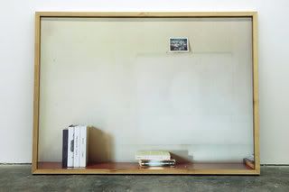
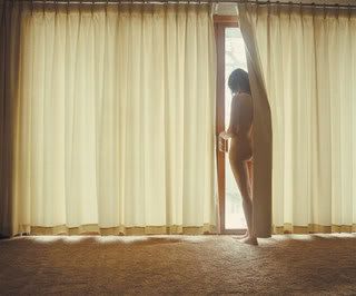
Leslie Hewit's large scale photos of absent pictures said a lot in their silence. And the simple placement of them leaned up against the wall only reemphasized the feeling of these forgotten places…neglected.
Michael Smith's Sears portrait series were effectively ironic. They are photos of him with his students over the years, where they're all optimistic smiles and he's this shrugging everyman. (I sadly couldn't find a picture of these!)
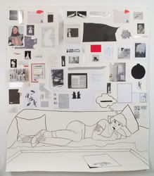
Frances Stark's large self portrait was a line drawing/collage I could really relate to...especially as an artist who incorporates myself into my own work. I admit that even though I liked it, I wondered if it really belonged in the Whitney Biennial versus a college student show. (Owww, what a backhanded compliment!)
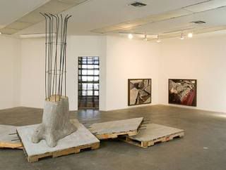
Ruben Ochoa's concrete sculpture was like a surreal upturned street. Unlike many other works in the industrial-material-sculpture-category (where piles of things are chaotically thrown together) his work is far more articulate…speaking of the relationship between the man-made and natural world.
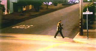
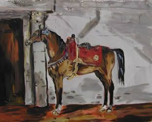
Robert Bechtle was one of the few painters, and a realistic painter to boot! He was like a fine swiss chocolate in a bowl of Skittles, as Sarah Vowell would say. I found his Hopper-esque still urban scenes extremely relevant.
Melanie Schiff's large scale photos presented thoughtful vignettes of real life without trying to be ironically banal about it. Beautifully crafted and poignant. Her work and Robert Bechtle both expressed a similar yearning for beauty amid the chaos of the sculptures surrounding them in the same room.
Adam Putnam's projected installation of doors was refreshingly simple, clean, and beautiful. But then again, I'm a sucker for a good door metaphor. (I couldn't find any pics of his work since it's projected)
Karen Kilimnik's small paintings depicting aristocratic European vignettes were wisely hung in their own separate little room arranged around a crystal chandelier. I find her style cheery yet aggressive in her use of bold color and decisive hand.
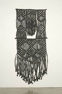
Amanda Ross-Ho's odd collection of artworks did not work together cohesively in my opinion, but I did simply adore her intricately cut canvas piece. It almost felt like some sort of artifact, an elaborate textile with some hidden significance. How this related to the giant litter box was lost on me.
John Baldesari's sculptural paintings were a lovely combination of flat and deep elements/ bright and subdued elements. Since I've always loved his work, I felt guilty for not recognizing his pieces straight away. But I suppose I'm just out of the loop.
Ellen Harvey's art-within-art sculpture was a hit with me. The front wall is full of empty salon-style frames in black and white…but one of the frames is open, revealing the same wall of frames behind it but they filled with color paintings. (I couldn't find pics of this artwork anywhere sadly)
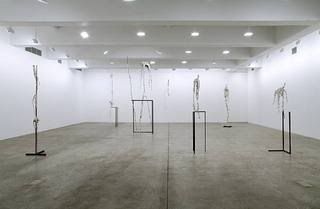
Charles Long's bizarre paper mache sculptures looked like they stepped out of a whimsical Giacometti dream. I was scared and intrigued by them at the same time.

No comments:
Post a Comment